 Team members
 We are hiring
 Our Services
 Development Methodology
 Infrastructure
 Overview
 Mobile app development
 IOS
IOS web development
 UX/UI Design
 iPhone
 Android
 Web Site
 Graphics Design
 Hire iPhone Developer
 Hire Android Developer
 Hire Web Developer
 Hire Joomla Developer
 Hire BlackBerry Developer
 Hire Titanium Developer
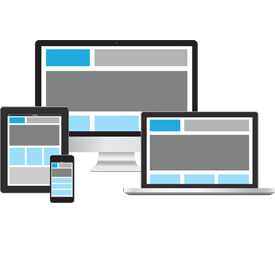
Responsive design
Responsive web design term is related to the concept of developing a website design in a manner that helps the lay out to get changed according to the user’s computer screen resolution. More precisely, the concept allows for an advanced 4 column layout 1292 pixels wide, on a 1025 pixel width screen, that auto-simplifies into 2 columns. Also, it suitably fixes on the smartphone and computer tablet screen. This particular designing technique we call “responsive design”.
Responsive web design is the practice of building a website suitable to work on every device and every screen size, no matter how large or small, mobile or desktop. Responsive web design is focused around providing an intuitive and gratifying experience for everyone. Desktop computer and cell phone users alike all benefit from responsive websites.
Not only can we incorporate responsive in your new website design scheme of things, but if you already have a website, we can modify it and make it responsive. Our team has all the tools and technology to make your website more accessible: media queries, flexible grid based layouts that use re-sizing, and flexible images & media.
